Maximizing Impact: The Role of Color in Business Card Design
6/3/2026, 10:10 AM · By Yossi Medina | Service: Business card design
TL;DR
Color plays a pivotal role in business card design, influencing perceptions and recall. By understanding color psychology, businesses can create impactful designs that resonate with their target audience, enhancing brand recognition and professionalism.
Discover how the strategic use of color in business card design can elevate your brand identity, leaving a lasting impression on potential clients and partners.
The Importance of Business Cards in Today’s Digital Age
In an age dominated by digital communication, business cards remain a vital tool for networking and branding. A well-designed business card acts as a tangible reminder of your professional identity and can set the tone for future interactions.
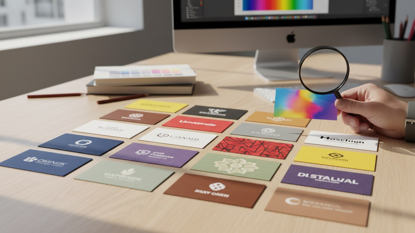
Understanding the Psychology of Color
Color is more than just an aesthetic choice; it evokes emotions and influences perceptions. Different colors can communicate a variety of messages, making the understanding of color psychology essential in your business card design. Here are some common associations:
- Red: Energy, passion, urgency
- Blue: Trust, dependability, professionalism
- Green: Growth, health, prosperity
- Yellow: Optimism, clarity, warmth
- Black: Sophistication, elegance, power
Creating Brand Consistency
When designing your business card, it's important to reflect your brand’s essence. The colors used should align with your overall branding strategy to ensure consistency across all marketing materials. This not only enhances brand recognition but also builds trust with your audience.
Maximizing Impact with Expert Design
At our digital agency, we specialize in business card design services that incorporate the principles of color psychology to create designs that resonate with your target audience. Our expert team works to:
- Understand your brand and target market
- Choose a color palette that aligns with your messaging
- Create visually appealing layouts that enhance readability
Case Study: Effective Color Use
For instance, when we worked with a financial services client, the strategic use of blue conveyed trust and professionalism, aligning perfectly with their brand identity. The result was a business card that not only looked great but strengthened their client's image in the market.
Tips for Designing Your Business Card
When creating your business card, consider the following tips to maximize its impact:
- **Be Clear**: Avoid clutter and ensure your contact information is easily readable.
- **Use Color Wisely**: Choose a color scheme that reflects your brand identity.
- **Include a Call to Action**: Encourage the recipient to take next steps, such as visiting your website or connecting on social media.
Don't forget that a well-thought-out business card can serve as a conversation starter or a memorable leave-behind during networking events.
Transform Your Networking Strategy
The role of color in business card design is significant and can greatly influence the first impression you leave on potential clients. By understanding how to use color effectively, you can enhance your business’s visibility and credibility.
Ready to take your business card design to the next level? Our team is here to help you every step of the way. Explore our business card design services today and maximize your impact.
For a personalized consultation and to discuss your design needs, contact us today!